2D Histogram Tutorial
This notebook shows an example of how to use the Hist2dQuadTree class in astroQTpy.
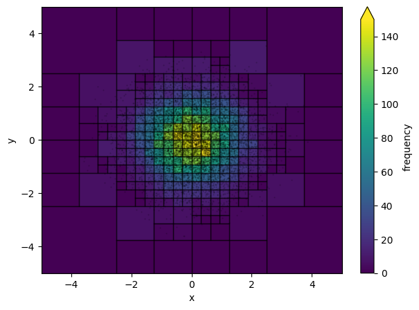
Simple 2D Gaussian
First, we’ll create some mock data drawn from two indepedent normal distributions.
[1]:
import numpy as np

N_samples = 10_000
x = np.random.normal(0, 1.0, N_samples)
y = np.random.normal(0, 1.0, N_samples)
Now import Hist2dQuadTree from the quadtree module in astroQTpy and create a new instance.
[2]:
from astroqtpy.quadtree import Hist2dQuadTree
[3]:
guassian_2d_histogram = Hist2dQuadTree(
    -5, 5, -5, 5,
    N_points=10,  # subdivide grid if node has more than this number of points...
    max_depth=6   # ...until the quadtree reaches this depth.
)
Now add the fake data to the quadtree object.
[4]:
guassian_2d_histogram.add_data(x, y)
Plot it!
[5]:
import matplotlib.pyplot as plt
[6]:
fig, ax = plt.subplots(figsize=(7,5))
ax.set_xlim(-5, 5)
ax.set_ylim(-5, 5)

# plot data
ax.scatter(x, y, marker='.', s=1, c='k', alpha=0.2, zorder=99)

# plot the quadtree
hist2d = guassian_2d_histogram.draw_tree(ax, cmap='viridis', vmin=0, vmax=150)
plt.colorbar(hist2d, ax=ax, label='frequency', extend='max')
ax.set_xlabel('x')
ax.set_ylabel('y')

plt.show()
Gaia H-R Diagram
As an example of something more specific to astronomy, let’s make an HRD using some Gaia data and astroQTpy.
First, we’ll need to pull some stellar data from the Gaia archive. We can do that with astroquery.
[7]:
from astroquery.gaia import Gaia
[8]:
import time

def get_gaia_query(q):
    start = time.time()
    job = Gaia.launch_job_async(q)
    print(f"Total time: {time.time()-start:0.2f} sec")
    return job.get_results()
For this example, we’ll keep our query simple. Let’s just take the first 10,000 sources from the astrophysical_parameters table that have calculated luminosity, Teff, mass, and logg.
[9]:
my_query = """
    SELECT TOP 10000 log10(lum_flame) AS log_lum,
        log10(teff_gspphot) AS log_teff,
        mass_flame AS mass,
        logg_gspphot AS log_g
    FROM gaiadr3.astrophysical_parameters
    WHERE lum_flame IS NOT NULL
        AND teff_gspphot IS NOT NULL
        AND mass_flame IS NOT NULL
        AND logg_gspphot IS NOT NULL
"""
[10]:
# run query and print first 5 rows
gaia_results = get_gaia_query(my_query)
gaia_results[:5]
INFO: Query finished. [astroquery.utils.tap.core]
Total time: 3.07 sec
[10]:
| log_lum | log_teff | mass | log_g |
|---|---|---|---|
| solMass | log(cm.s**-2) | ||
| float64 | float64 | float32 | float32 |
| 1.2749642400672603 | 3.6923804426660096 | 1.7511332 | 3.0866 |
| -0.15209091918954543 | 3.759134754558573 | 0.9997815 | 3.8079 |
| 0.07155341905131725 | 3.74890517466525 | 0.9144622 | 4.3056 |
| -1.1327641494248981 | 3.5804863065072805 | 0.554074 | 4.815 |
| -0.5058447747626346 | 3.677801592462263 | 0.7655453 | 4.6798 |
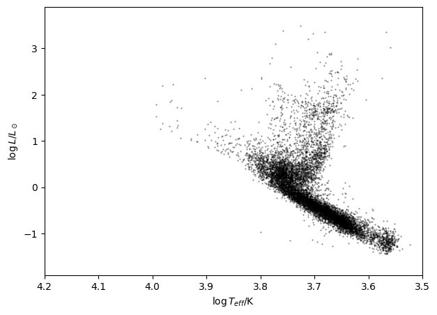
Let’s plot the Gaia data on an H-R Diagram.
[11]:
fig, ax = plt.subplots(figsize=(7,5))
ax.set_xlim(3.5, 4.2)
ax.set_ylim(-1.9, 3.9)

ax.scatter(gaia_results['log_teff'], gaia_results['log_lum'], marker='.', s=1, c='k', alpha=0.5)
ax.set_xlabel('$\log T_{eff}$/K')
ax.set_ylabel('$\log L / L_\odot$')

ax.invert_xaxis()
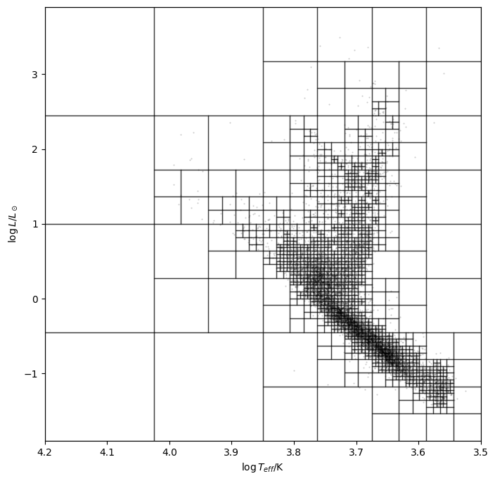
Now we can use an astroQTpy quadtree to resctructure the data and create some useful visualizations. Let’s go ahead and import the Hist2dQuadTree class and create a new instance, like we did before. Then, we’ll add the Gaia data.
[12]:
hrd_2d_histogram = Hist2dQuadTree(
    3.5, 4.2, -1.9, 3.9,
    N_points=5,   # subdivide grid if node has more than this number of points...
    max_depth=8   # ...until the quadtree reaches this depth.
)

# add data
hrd_2d_histogram.add_data(gaia_results['log_teff'].value.data, gaia_results['log_lum'].value.data)
First, let’s plot the data and quadtree without shading in the nodes (the plot can start looking a bit busy depending on the maximum depth, number of points per node, etc.).
[13]:
fig, ax = plt.subplots(figsize=(8,8))
ax.set_xlim(3.5, 4.2)
ax.set_ylim(-1.9, 3.9)

# plot data
ax.scatter(gaia_results['log_teff'], gaia_results['log_lum'], marker='.', s=1, c='k', alpha=0.2, zorder=99)

# plot the quadtree
hist2d = hrd_2d_histogram.draw_tree(ax, show_colors=False, cmap='viridis', vmin=0)
ax.set_xlabel('$\log T_{eff}$/K')
ax.set_ylabel('$\log L / L_\odot$')

ax.invert_xaxis()

plt.show()
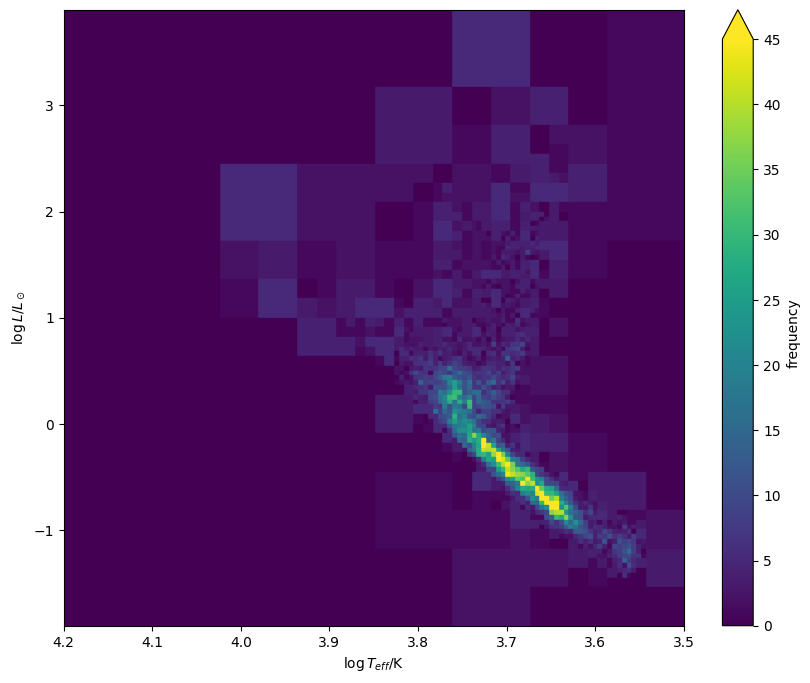
Now let’s visualize the HRD a slightly different way, this time turning back on the colors, but removing the node borders and data points. This time we get a plot that looks a bit cleaner!
[14]:
fig, ax = plt.subplots(figsize=(10,8))
ax.set_xlim(3.5, 4.2)
ax.set_ylim(-1.9, 3.9)

# plot the quadtree
hist2d = hrd_2d_histogram.draw_tree(ax, show_lines=False, cmap='viridis', vmin=0, vmax=45)
plt.colorbar(hist2d, ax=ax, label='frequency', extend='max')
ax.set_xlabel('$\log T_{eff}$/K')
ax.set_ylabel('$\log L / L_\odot$')

ax.invert_xaxis()

plt.show()
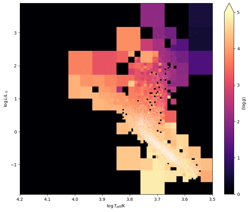
Instead of counting the frequency of points within each node, we can select different bin statistics to visualize useful quantities. For example, we can plot the average \(\log g\) of stars within each grid cell. To do this, we just need to pass a third data array to the quadtree object and choose a node statistic.
[15]:
hrd_2d_histogram = Hist2dQuadTree(
    3.5, 4.2, -1.9, 3.9,
    N_points=5,   # subdivide grid if node has more than this number of points...
    max_depth=8,  # ...until the quadtree reaches this depth.
    node_statistic='mean'
)

hrd_2d_histogram.add_data(
    gaia_results['log_teff'].value.data,
    gaia_results['log_lum'].value.data,
    gaia_results['log_g'].value.data
)
Let’s plot the HRD again, this time showing the points and colors representing average \(\log g\).
[16]:
fig, ax = plt.subplots(figsize=(10,8))
ax.set_xlim(3.5, 4.2)
ax.set_ylim(-1.9, 3.9)

# plot data
ax.scatter(gaia_results['log_teff'], gaia_results['log_lum'], c='w', marker='.', s=1, alpha=0.2, zorder=99)

# plot the quadtree
hist2d = hrd_2d_histogram.draw_tree(ax, show_lines=False, cmap='magma', vmin=0, vmax=5)
plt.colorbar(hist2d, ax=ax, label='$\langle \log g \\rangle$', extend='max')
ax.set_xlabel('$\log T_{eff}$/K')
ax.set_ylabel('$\log L / L_\odot$')

ax.invert_xaxis()

plt.show()